Search Icon
All
articles
infographics
videos
guides

How to prep digital art files for printing labels

prep-art-for-labels<p>You&#8217;ve just spent multiple hours working on your label artwork and it looks absolutely perfect! Let&#8217;s pretend you&#8217;ve created this label for your health supplement company ENDUR „¢, and your product is called PREPARE, a pre-workout supplement. But &#8230; that&#8217;s only the beginning. Somehow we have to get what&#8217;s on your screen onto a sticky piece of paper/plastic. By following the 8 steps in this post, you&#8217;ll be able to take your perfect label and make it ready for print.</p> <h2>1. Understand raster and vector</h2> <p>There are two models of digital art creation: raster and vector. <strong>Raster images</strong> are made from a grid of little squares, called pixels. Each square is assigned a color. When you zoom in, you start to see the squares. Photographs are raster images. <strong>Vector images</strong> are mathematical calculations that form geometric shapes. When you zoom in, you will always see sharp crisp edges. The more vector your art, the better it will print.</p> <h2><a href=https://www.containerandpackaging.com/blog/wp-content/uploads/rasterVSvector.png><img class=aligncenter wp-image-2609 size-full src=https://www.containerandpackaging.com/blog/wp-content/uploads/rasterVSvector.png alt=rasterVSvector width=577 height=171 srcset=https://cpazurefilestorage.blob.core.windows.net/website-images/legacyBlogImages/rasterVSvector.png 577w, https://cpazurefilestorage.blob.core.windows.net/website-images/legacyBlogImages/rasterVSvector-150x44.png 150w, https://cpazurefilestorage.blob.core.windows.net/website-images/legacyBlogImages/rasterVSvector-464x137.png 464w sizes=(max-width: 577px) 100vw, 577px /></a><br /> 2. Use software that produces vector art</h2> <p>Most designers use <strong>Adobe ® Illustrator<strong> ®</strong></strong> or <strong>Adobe<strong> ®</strong> InDesign<strong> ®</strong></strong> to produce their art. Both of these programs use the vector model as their defaults. <strong>Adobe<strong> ®</strong> Photoshop<strong> ®</strong></strong> can handle vector art, but it does NOT save your art as vector (that&#8217;s why it&#8217;s greyed out below). Photoshop&#8217;s default model is raster because it&#8217;s a photo editor; use Photoshop to prepare and edit your raster images.</p> <p>Monthly subscriptions for these apps can be downloaded from Adobe.com for fairly economical prices. These are the best out there and they&#8217;re what everyone uses &#8230; so I can&#8217;t really recommend anything else. If you&#8217;ve got a one-time project, hire one of our designers to do the project for you.<strong><a href=https://www.containerandpackaging.com/blog/wp-content/uploads/adobevectorapps.png><img class=aligncenter wp-image-2619 size-full src=https://www.containerandpackaging.com/blog/wp-content/uploads/adobevectorapps.png alt=adobevectorapps width=377 height=123 srcset=https://cpazurefilestorage.blob.core.windows.net/website-images/legacyBlogImages/adobevectorapps.png 377w, https://cpazurefilestorage.blob.core.windows.net/website-images/legacyBlogImages/adobevectorapps-150x48.png 150w sizes=(max-width: 377px) 100vw, 377px /></a></strong></p> <h2>3. Set up your document</h2> <p><strong>Trim dimensions and bleeds.</strong> Enter your label&#8217;s width and height and give it a bleed of 0.125 inches. Bleeds allow you to have clean edges when your label gets trimmed. Also, you&#8217;ll want to make sure that any critical text or graphics stays at least 1/16 inch from the trim lines.</p> <p><strong>Set your color mode.</strong> Labels are full color. It costs the same to print a label whether it&#8217;s 1 color or full color. Most labels use a digital color process. We combine red, yellow, blue and black to make every color you can imagine. This is what we call <a title=What you need to know about silk printing and label printing href=https://www.containerandpackaging.com/blog/2012/01/what-you-need-to-know-about-silk-printing-and-label-printing/>CMYK</a>: cyan, magenta, yellow, and key (black). If you have a favorite <a title=Ode to Lawrence Herbert and his PANTONE ® color system href=https://www.containerandpackaging.com/blog/2009/11/ode-to-lawrence-herbert-and-his-pantone-color-system/>PANTONE ® color</a>, convert it to a CMYK color and design your artwork in CMYK.</p> <p><strong>Max out your raster effects. </strong>Many labels combine raster art and vector art. This allows you to place photography-quality images on your label. Make sure that you&#8217;ve set your raster effects at their highest setting.</p> <h2><a href=https://www.containerandpackaging.com/blog/wp-content/uploads/setupyourdocument.png><img class=aligncenter wp-image-2594 size-full src=https://www.containerandpackaging.com/blog/wp-content/uploads/setupyourdocument.png alt=setupyourdocument width=713 height=662 srcset=https://cpazurefilestorage.blob.core.windows.net/website-images/legacyBlogImages/setupyourdocument.png 713w, https://cpazurefilestorage.blob.core.windows.net/website-images/legacyBlogImages/setupyourdocument-150x139.png 150w, https://cpazurefilestorage.blob.core.windows.net/website-images/legacyBlogImages/setupyourdocument-210x195.png 210w sizes=(max-width: 713px) 100vw, 713px /></a>4. Place raster images</h2> <p>Adding photography to your full color label is a great way to maximize visual impact. To do this, you need to make sure you have a high-quality image with the following specs (you should do all of this in Photoshop):</p> <ul> <li>CMYK color mode</li> <li>at least 300 dots per inch (dpi); this refers to the density of pixels per inch. Images that exceed about 340 dpi are downscaled automatically by the print machines</li> <li>scaled to 100%</li> <li>cropped (in Photoshop) to your bleed dimensions (this helps reduce file size and increase file efficiency)</li> </ul> <p>Once your image is prepared, you need to &#8220;place&#8221; it into your Illustrator or InDesign document. Click on the FILE menu and select PLACE:</p> <p><a href=https://www.containerandpackaging.com/blog/wp-content/uploads/Screen-Shot-2014-09-23-at-10.55.09-AM.png><img class=aligncenter wp-image-2597 size-full src=https://www.containerandpackaging.com/blog/wp-content/uploads/Screen-Shot-2014-09-23-at-10.55.09-AM.png alt=Screen Shot 2014-09-23 at 10.55.09 AM width=281 height=551 srcset=https://cpazurefilestorage.blob.core.windows.net/website-images/legacyBlogImages/Screen-Shot-2014-09-23-at-10.55.09-AM.png 281w, https://cpazurefilestorage.blob.core.windows.net/website-images/legacyBlogImages/Screen-Shot-2014-09-23-at-10.55.09-AM-76x150.png 76w, https://cpazurefilestorage.blob.core.windows.net/website-images/legacyBlogImages/Screen-Shot-2014-09-23-at-10.55.09-AM-99x195.png 99w sizes=(max-width: 281px) 100vw, 281px /></a>Move your placed image until it fits inside your bleed line. Bleeds are critical &#8230; they ensure that you don&#8217;t have any white on the edges when your label gets trimmed. Bleeds need to be 1/8 of an inch on all sides.</p> <h2><a href=https://www.containerandpackaging.com/blog/wp-content/uploads/placedimage.png><img class=aligncenter wp-image-2598 size-full src=https://www.containerandpackaging.com/blog/wp-content/uploads/placedimage.png alt=placedimage width=694 height=327 srcset=https://cpazurefilestorage.blob.core.windows.net/website-images/legacyBlogImages/placedimage.png 694w, https://cpazurefilestorage.blob.core.windows.net/website-images/legacyBlogImages/placedimage-150x70.png 150w, https://cpazurefilestorage.blob.core.windows.net/website-images/legacyBlogImages/placedimage-413x195.png 413w sizes=(max-width: 694px) 100vw, 694px /></a><br /> 5. Add type, logos, and vector-based visual elements</h2> <p>On top of your placed image, add your type and your logos. Because we are using Illustrator (or InDesign) rather than Photoshop, when we prep our file for print, our fonts will remain vector, rather than be converted to raster. This means our fonts will be sharper.
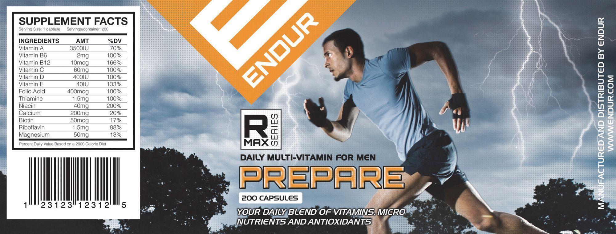
</p> <p><strong>Fonts.</strong> Your fonts should be NO SMALLER than 4pt. Also, go easy on the copy. A label is not the place to put your doctoral dissertation. Also, make sure that your fonts aren&#8217;t too light or thin. Obviously, the bolder the better. Print off your label scaled at 100%. It&#8217;s it&#8217;s too hard to read, it will be too hard to read.</p> <p><strong>Lines.</strong> If you have lines in your artwork (like in my &#8220;Supplement Facts&#8221; below), they should not be finer than 1pt thick.</p> <p><strong>Rich black vs 100% black.</strong> As you&#8217;re designing for labels, be sure to use the right black. Rich black is made by mixing 100% cyan, 100% magenta, 100% yellow, and 100% black. On your computer screen this looks very &#8220;rich.&#8221; When you print, however, your blacks will not be &#8220;pure,&#8221; they&#8217;ll look less crisp. Instead, use 0% cyan, 0% magenta, 0% yellow, 100% black. To make sure your blacks are handled properly, go to PREFERENCES (in Illustrator) and make the following changes to your &#8220;Appearance of Black&#8221; tab.</p> <p><a href=https://www.containerandpackaging.com/blog/wp-content/uploads/appearanceofblack.png><img class=aligncenter wp-image-2628 size-full src=https://www.containerandpackaging.com/blog/wp-content/uploads/appearanceofblack.png alt=appearanceofblack width=835 height=635 srcset=https://cpazurefilestorage.blob.core.windows.net/website-images/legacyBlogImages/appearanceofblack.png 835w, https://cpazurefilestorage.blob.core.windows.net/website-images/legacyBlogImages/appearanceofblack-150x114.png 150w, https://cpazurefilestorage.blob.core.windows.net/website-images/legacyBlogImages/appearanceofblack-256x195.png 256w sizes=(max-width: 835px) 100vw, 835px /></a></p> <p><strong>Wraps and panels.</strong> The wrap refers to how your label &#8220;wraps&#8221; around your container, and a <a title=The Anatomy of a Label: the right pieces in the right places href=https://www.containerandpackaging.com/blog/2013/05/the-anatomy-of-a-label-the-right-pieces-in-the-right-places/>panel</a> is the &#8220;side&#8221; of the label that you can see without having to rotate the container when the label has been applied. We typically have three panels with a label: the front, the left and the right. You can have a two-panel label too: the front and back. We can only see about <a title=Infographic: 8 point checklist to making the perfect label href=https://www.containerandpackaging.com/blog/2013/01/infographic-8-point-checklist-to-making-the-perfect-label/>29% of the label&#8217;s width</a>. Be sure to consider than when designing your label.</p> <p><strong>Beware reverse type.</strong> Standard type is black fonts on a white page &#8230; like books. Reverse type means that you&#8217;ve but lighter colored fonts on a dark background. On our label below, &#8220;ENDUR&#8221; is reverse type. &#8220;Your daily blend of Vitamins, Micro Nutrients and Antioxidants&#8221; is also reverse type. In each of these cases, I have used heavy white fonts on a colored background. This will reduce the chance that the enclosed spaces (called closed counters) in letters like q, e, o, p, a, d, g, and b get filled in.</p> <h2><a href=https://www.containerandpackaging.com/blog/wp-content/uploads/finallabel.png><img class=aligncenter wp-image-2599 size-full src=https://www.containerandpackaging.com/blog/wp-content/uploads/finallabel.png alt=finallabel width=689 height=286 srcset=https://cpazurefilestorage.blob.core.windows.net/website-images/legacyBlogImages/finallabel.png 689w, https://cpazurefilestorage.blob.core.windows.net/website-images/legacyBlogImages/finallabel-150x62.png 150w, https://cpazurefilestorage.blob.core.windows.net/website-images/legacyBlogImages/finallabel-464x192.png 464w sizes=(max-width: 689px) 100vw, 689px /></a><br /> 6. Prepare file for print</h2> <p><strong>Convert fonts to outlines. </strong>We may not have your fonts. The printer may not have your fonts either. So you need to convert your fonts to outlines so that when we open your file it doesn&#8217;t substitute one of our fonts for the font you used. When you convert a font to outlines it changes your fonts into vector graphics. BEWARE &#8230; once you do this, you can&#8217;t edit your text anymore. I ALWAYS keep two copies of my art &#8230; the editable AI or INDD file PLUS the PDF file that we are about to create. If you follow my prep sequence below, you&#8217;ll end up with a print-ready PDF and an editable working copy of your art. To convert to fonts, select all your text boxes and then click on the TYPE menu and select CREATE OUTLINES.</p> <ul> <li>SAVE your file. Proofread everything and make sure your AI file is all ship-shape.</li> <li>Convert type to outlines (select all your text boxes and then choose TYPE &gt; CREATE OUTLINES from the top menu)</li> <li>Go to FILE &gt; SAVE AS (if you do FILE &gt; SAVE, you&#8217;ll save over your editable text with outline text. You will NOT be able to edit your text, so be sure to do FILE &gt; SAVE AS.)</li> <li>Give your document a name.</li> <li>Browse to where you would like to save your file.</li> <li>Select &#8220;Adobe PDF (pdf)&#8221; from the FORMAT dropdown. THIS IS CRITICAL!</li> <li>Click SAVE.</li> </ul> <p><span style=text-align: left;><a href=https://www.containerandpackaging.com/blog/wp-content/uploads/saveas.png><img class=aligncenter wp-image-2600 size-full src=https://www.containerandpackaging.com/blog/wp-content/uploads/saveas.png alt=saveas width=826 height=580 srcset=https://cpazurefilestorage.blob.core.windows.net/website-images/legacyBlogImages/saveas.png 826w, https://cpazurefilestorage.blob.core.windows.net/website-images/legacyBlogImages/saveas-150x105.png 150w, https://cpazurefilestorage.blob.core.windows.net/website-images/legacyBlogImages/saveas-277x195.png 277w sizes=(max-width: 826px) 100vw, 826px /></a></span></p> <ul> <li>The following dialogue box will appear. Select &#8220;[Illustrator Default]&#8221; as your ADOBE PDF PRESET.</li> </ul> <p><a href=https://www.containerandpackaging.com/blog/wp-content/uploads/Screen-Shot-2014-09-23-at-11.18.03-AM.png><img class=alignnone size-full wp-image-2601 src=https://www.containerandpackaging.com/blog/wp-content/uploads/Screen-Shot-2014-09-23-at-11.18.03-AM.png alt=Screen Shot 2014-09-23 at 11.18.03 AM width=816 height=698 srcset=https://cpazurefilestorage.blob.core.windows.net/website-images/legacyBlogImages/Screen-Shot-2014-09-23-at-11.18.03-AM.png 816w, https://cpazurefilestorage.blob.core.windows.net/website-images/legacyBlogImages/Screen-Shot-2014-09-23-at-11.18.03-AM-150x128.png 150w, https://cpazurefilestorage.blob.core.windows.net/website-images/legacyBlogImages/Screen-Shot-2014-09-23-at-11.18.03-AM-227x195.png 227w sizes=(max-width: 816px) 100vw, 816px /></a></p> <ul> <li><span style=text-align: left;>Click on the &#8220;Compression&#8221; tab in the left sidebar, and use the following settings: </span></li> </ul> <p><a href=https://www.containerandpackaging.com/blog/wp-content/uploads/Screen-Shot-2014-09-23-at-11.18.06-AM.png><img class=alignnone size-full wp-image-2602 src=https://www.containerandpackaging.com/blog/wp-content/uploads/Screen-Shot-2014-09-23-at-11.18.06-AM.png alt=Screen Shot 2014-09-23 at 11.18.06 AM width=816 height=698 srcset=https://cpazurefilestorage.blob.core.windows.net/website-images/legacyBlogImages/Screen-Shot-2014-09-23-at-11.18.06-AM.png 816w, https://cpazurefilestorage.blob.core.windows.net/website-images/legacyBlogImages/Screen-Shot-2014-09-23-at-11.18.06-AM-150x128.png 150w, https://cpazurefilestorage.blob.core.windows.net/website-images/legacyBlogImages/Screen-Shot-2014-09-23-at-11.18.06-AM-227x195.png 227w sizes=(max-width: 816px) 100vw, 816px /></a></p> <ul> <li><span style=text-align: left;>Click on the &#8220;Marks and Bleeds&#8221; tab in the left sidebar, and use the following settings: </span></li> </ul> <p><a href=https://www.containerandpackaging.com/blog/wp-content/uploads/Screen-Shot-2014-09-23-at-11.32.07-AM.png><img class=alignnone size-full wp-image-2604 src=https://www.containerandpackaging.com/blog/wp-content/uploads/Screen-Shot-2014-09-23-at-11.32.07-AM.png alt=Screen Shot 2014-09-23 at 11.32.07 AM width=816 height=698 srcset=https://cpazurefilestorage.blob.core.windows.net/website-images/legacyBlogImages/Screen-Shot-2014-09-23-at-11.32.07-AM.png 816w, https://cpazurefilestorage.blob.core.windows.net/website-images/legacyBlogImages/Screen-Shot-2014-09-23-at-11.32.07-AM-150x128.png 150w, https://cpazurefilestorage.blob.core.windows.net/website-images/legacyBlogImages/Screen-Shot-2014-09-23-at-11.32.07-AM-227x195.png 227w sizes=(max-width: 816px) 100vw, 816px /></a></p> <ul> <li><span style=text-align: left;>Click SAVE PDF and &#8230; you&#8217;re done!</span></li> </ul> <h2>7. Review your print-ready artwork</h2> <p>Open your PDF file and check it out. Notice that you&#8217;ve got trim marks in the corners (this shows the printer where to cut your label). Also notice that the page information has been included on the top. The page information includes your file name, how many artboards are included, plus the date and time that you created the PDF.</p> <p><strong>PRINT IT OUT and try it on. </strong>You&#8217;ll be amazed at how many problems you&#8217;ll catch if you do this simple trick. Print your label out (on ANY high or low-quality printer, it doesn&#8217;t matter), cut it out, and tape it to your container. You&#8217;ll quickly see that your front panel is too wide, your text is too small, your label doesn&#8217;t fit, the wrap doesn&#8217;t line up, etc. etc.</p> <p><a href=https://www.containerandpackaging.com/blog/wp-content/uploads/finalpdf.png><img class=alignnone size-large wp-image-2605 src=https://www.containerandpackaging.com/blog/wp-content/uploads/finalpdf-1024x450.png alt=finalpdf width=700 height=307 srcset=https://cpazurefilestorage.blob.core.windows.net/website-images/legacyBlogImages/finalpdf-1024x450.png 1024w, https://cpazurefilestorage.blob.core.windows.net/website-images/legacyBlogImages/finalpdf-150x65.png 150w, https://cpazurefilestorage.blob.core.windows.net/website-images/legacyBlogImages/finalpdf-443x195.png 443w, https://cpazurefilestorage.blob.core.windows.net/website-images/legacyBlogImages/finalpdf.png 1380w sizes=(max-width: 700px) 100vw, 700px /></a></p> <h2>8. Submit your artwork for an art check</h2> <p>The last step is to have someone check your art and make sure that it&#8217;s going to print successfully. The last thing that you want to do is print hundreds of your label and find that they aren&#8217;t the right size, the image is fuzzy, the text is too hard to read, or the color is off &#8230; Pay the nominal fee to have your art checked by our designer, and you can move forward with the assurance that you haven&#8217;t made any mistakes. We wish you the best of luck with preparing art files for label printing.</p> <hr /> <p>&nbsp;</p> <p>
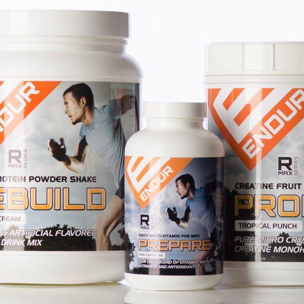
Behold, the finished product. A quality label on a quality container is a quality thing.</p> <p><a href=https://www.containerandpackaging.com/services/portfolio/images/Endur/003.jpg><img class=aligncenter src=https://www.containerandpackaging.com/services/portfolio/images/Endur/003.jpg alt=ENDUR Prepare Label width=600 height=600 /></a></p> <p><b>Have any questions on what to do? Ask us in the comments.</b></p>
Back To Top IconBack To Top